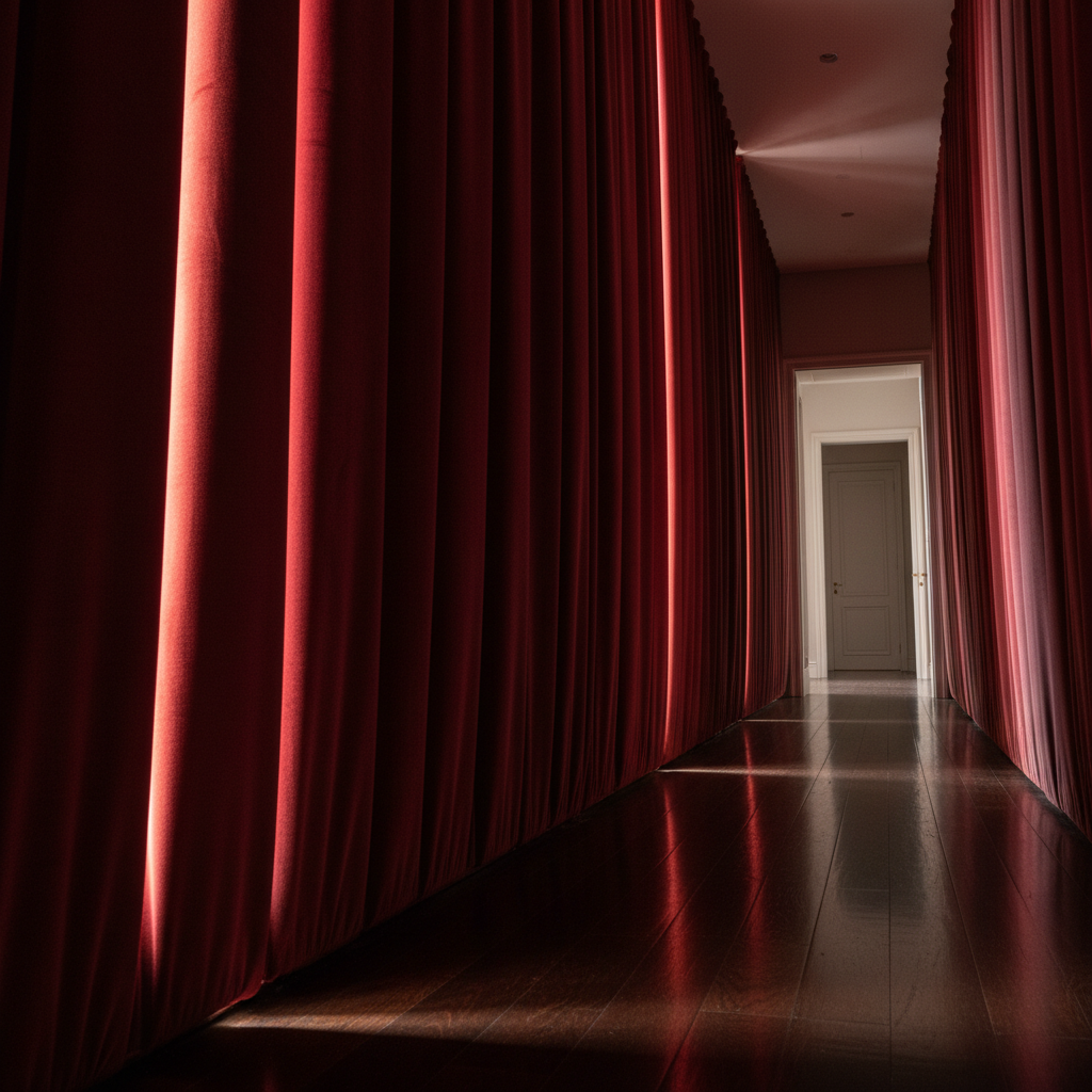
luxury italian fabrics are easiest to specify well when velvet is treated as a family of structures rather than a single finish. In paneled rooms the distinction is especially important, because panels create repeated light angles that expose every material choice.
The Met’s description of Italian velvet from the second half of the 15th century is a good technical shortcut. It identifies cut, voided, and brocaded effects within a single luxury material tradition. Source: The Met, Panel of velvet.
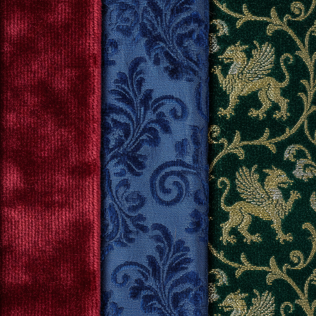
Cut velvet usually gives the most direct signal: rich pile, immediate softness, and strong response to changing light direction. In panel systems that can be powerful, but it can also exaggerate inconsistency if seams, trim widths, or panel depths are not precise.
Voided velvet behaves differently. Because part of the design reads through the contrast between pile and ground, it often produces more graphic legibility at middle distance. In paneled rooms that can be useful where architecture is already strong and the textile needs to support it rather than blur it.
Brocaded velvet adds another layer through supplementary material effects. The result can be extraordinary, but it also demands restraint in surrounding finishes. Mirror, brass, lacquer, and high-sheen paint already compete for reflected light. A brocaded velvet panel should be used where the room can afford concentration rather than everywhere at once.
The practical specification lesson is to assign a role to each structure. Cut velvet for depth. Voided velvet for pattern clarity. Brocaded velvet for controlled emphasis. Once that logic is clear, paneled rooms become easier to balance.
The mistake is to select all velvet by showroom impression. Velvet should be selected by how it behaves once repeated across architecture. In paneled interiors that behavior is what clients end up living with every day.